________________________________________
In the summer of 2017 I interned at Adobe Design
on the Brand & Experience Team
________________________________________
—The Project—
Create a better 'On-Boarding Kit'
that can be scaled to all new hires
at Adobe Design offices worldwide
—The Goal—
How might we improve
New Hire on-boarding experience
at Adobe Design?
— The Process —
—the list of Interviewees—
12 New Hires
Operational Program Managers
Talent Partners
On-boarding Coordinators
Senior Group Program Manager
(details of which may not be revealed due to confidentiality issues)
—Voices From The New Hires—


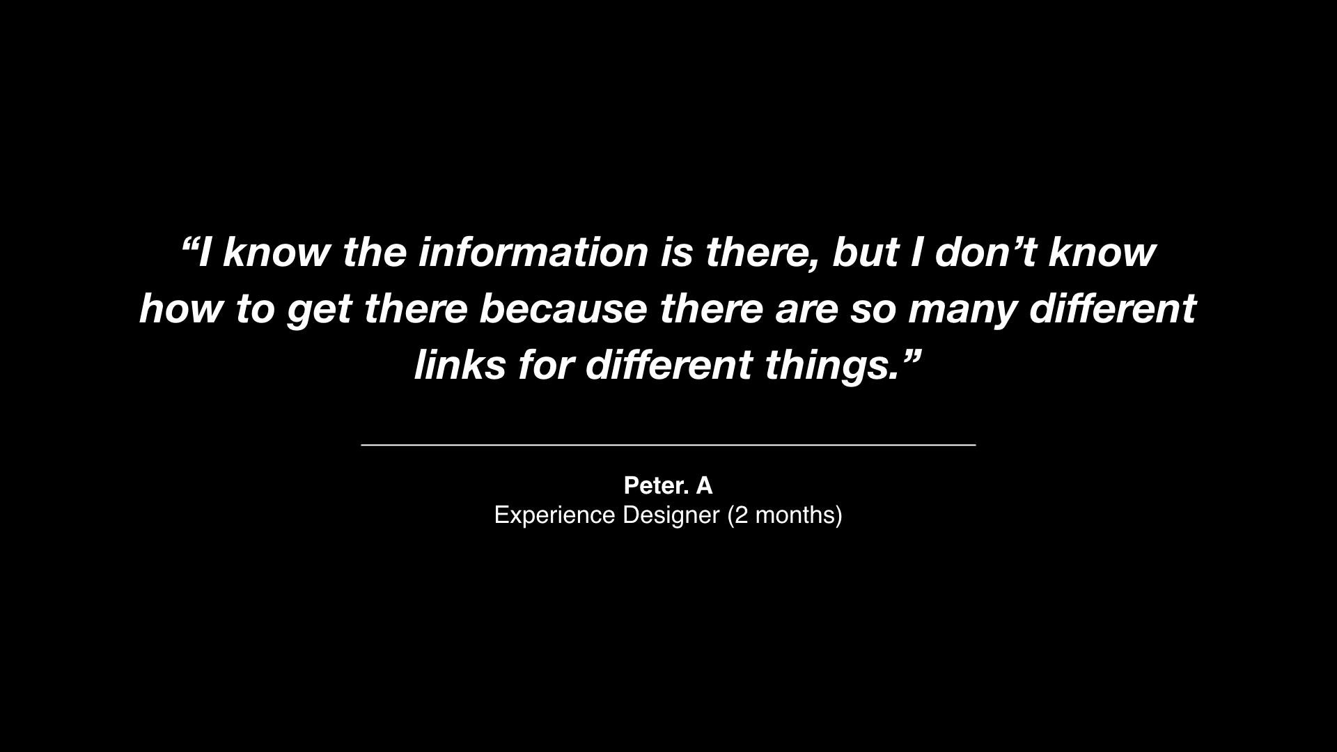
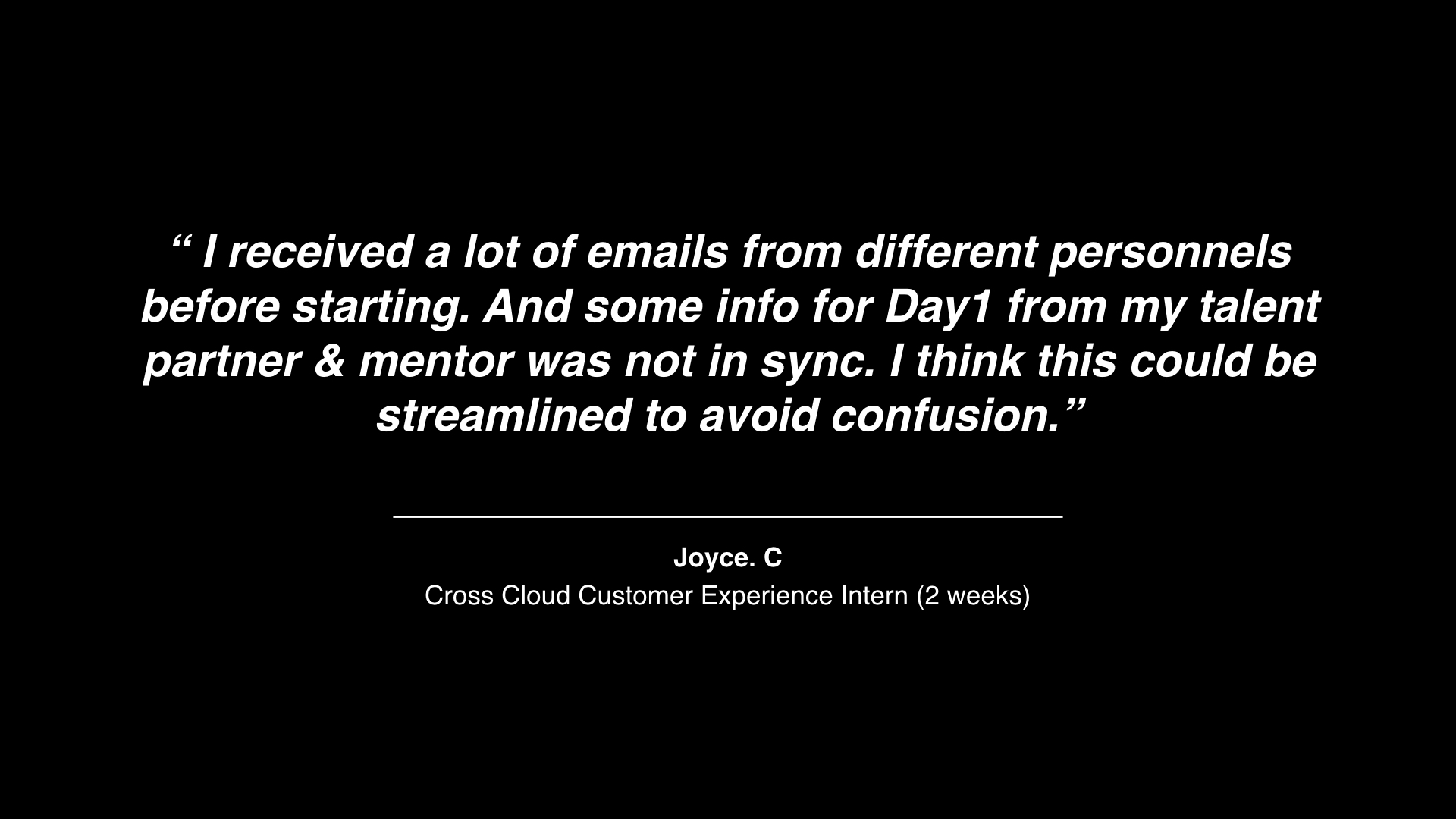

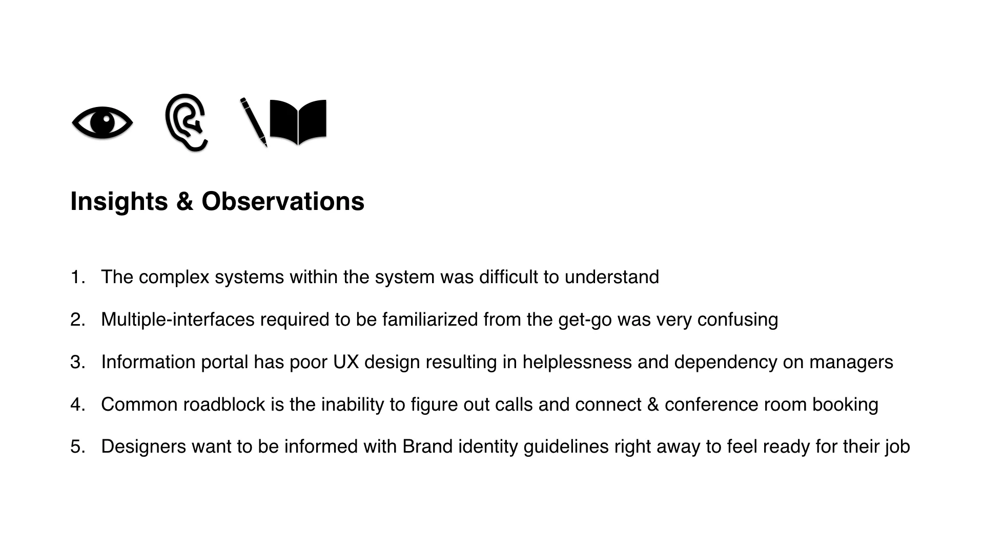
—Unexpected Answers From More Than One New Hire Feedback—
—List of ideas to entice new hire experience—
Pre-Hire Ideas
Digital/Visual Wayfinding materials
“Playing It Cool” guide (how to dress, park my bike, adjust my chair, etc)
Preinstalling Adobe Clean Typeface and preinstalling creative cloud on laptops to minimize 1st week set-up workload
On-boarding Kit Ideas
Adobe Design Culture Book (Referencing “57 Things” publication)
Adobe Designer Book —Branding Guidelines
Casual Reality TV Style Internal Videos —New Hire 101
Paper Bag/Tote Bag to carry all swags, freebies, important handouts
Motivational Post-it notes
New hire customized products (Book sleeves or hoodie with employee name on it)
Visually enticing zines distilling the most useful information per category on 1st week/1st month
Customized emojis for new hires on slack
After doing some primary research and hearing from the users, I gathered some secondary research on cost, timeline and feasibility, I sat down with my manager
to discuss the key take aways and drafted
a plan of action:
Review of Day 1 Orientation Materials
(Left) Handouts: Map/IT Information/Employee benefits info
(Right) New hire swags: Moleskin notebook/branded pencil/water bottle/earphone/stickers
After several rounds of discussion amongst the team, we have decided on 2 focused deliverables during the course of my internship.
1. THE “ADOBE DESIGN” BOOK
Showcase company culture, value & the brand
Hear from creative leaders
Provide a better overview of the organizational structure
within Adobe Design
2. CORE INFO ZINES
Help make overwhelming information digestible
Highlight key-attention items for 1st month to ease the stress of missing important to-do items
To make a strong first impression of the Adobe Design brand
—The Design Phase—
Establishing A Visual System
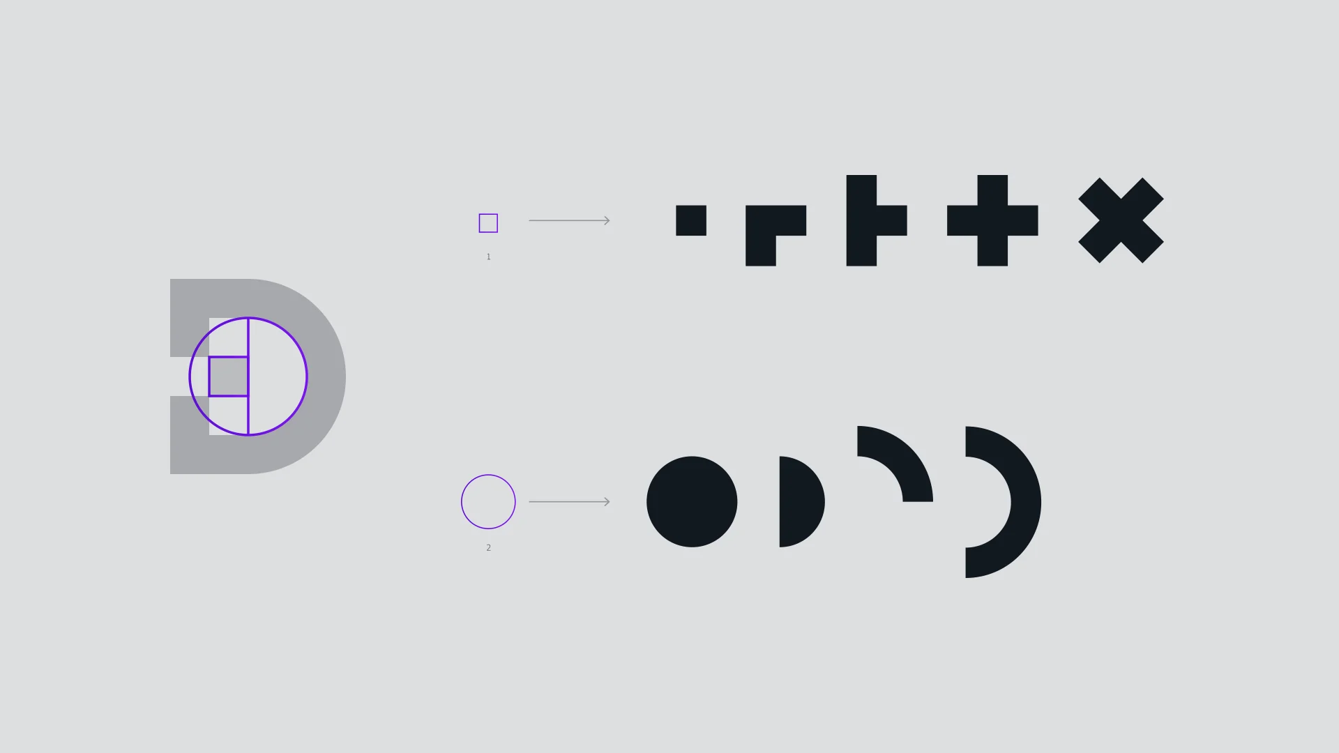
Adobe Design Logo Breakdown
—Beginning with the visual language—
When I took a closer look at the existing branding concept of Adobe Design, what stood out to me the most was how Senior Experience Designer; Anny Chen told the story of the essence behind the logo concept:
“We want to represent forward thinking design by one simple timeless design move—a pixel shift”
It became very apparent to me that the heartbeat of this brand identity is its simple pixel shift. I created this animation to highlight the movement, growth and livelihood of Adobe Design as represented by the climatic pixel pulse of ideas and innovations living within its purest form of the logo D.
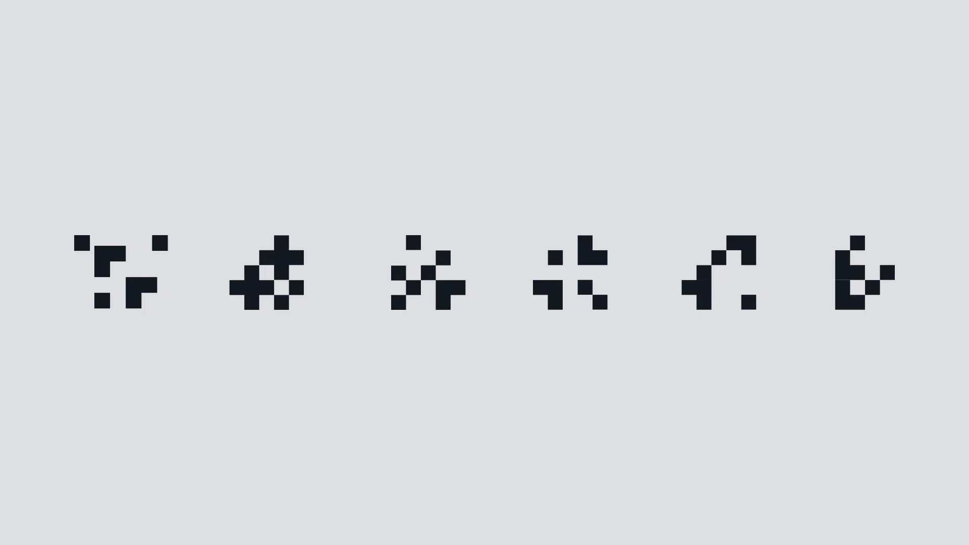
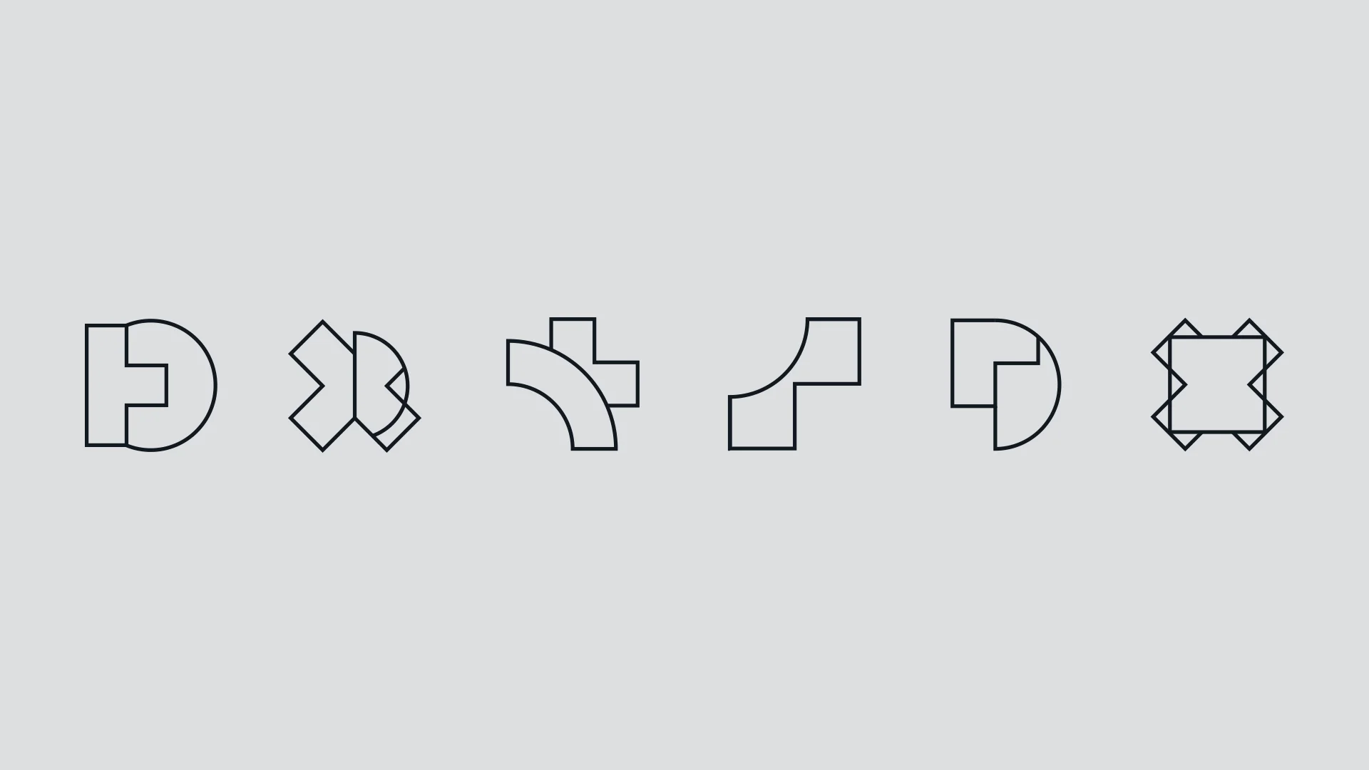
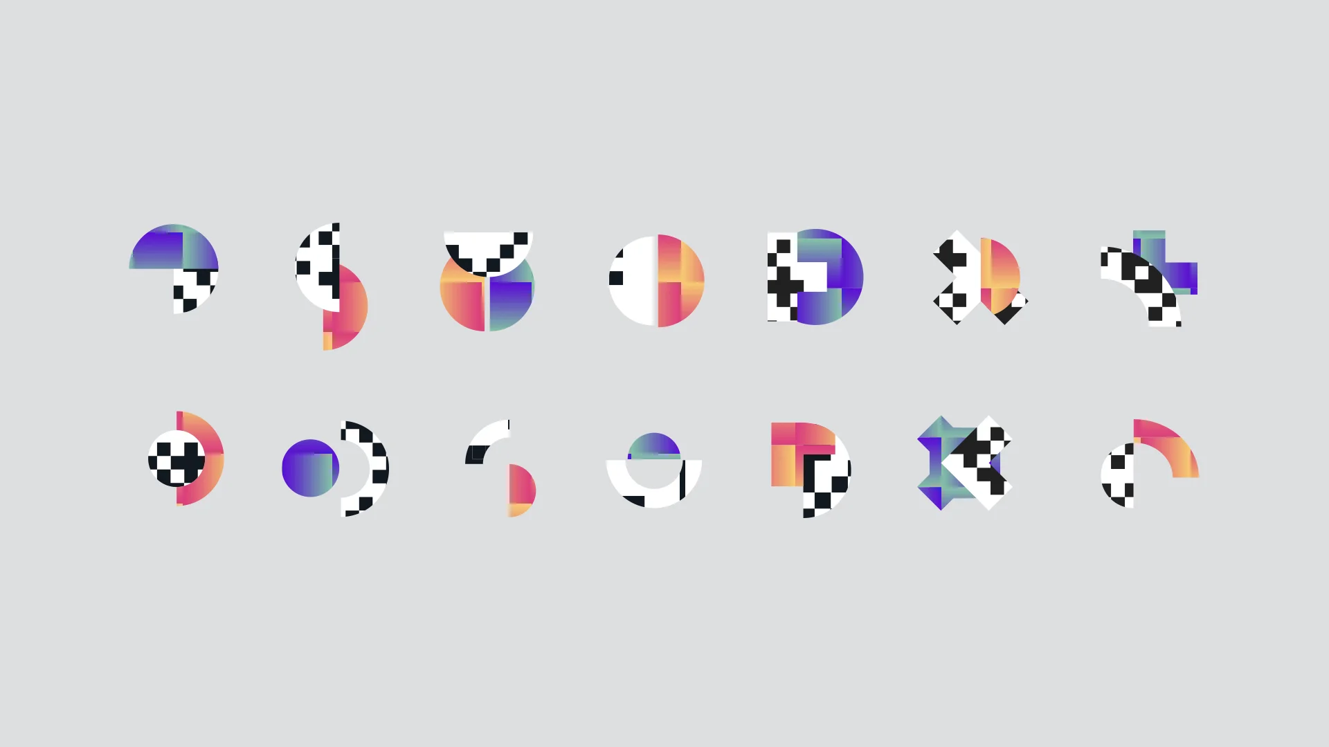
I also took the "one-pixel" shift concept to another level by rebuilding the pixels and reinventing interchangeable systems could can be scaled and implemented into book layout grids.
Each of these brand elements are a result of a combination of 2 shapes, representing a visual metaphor for when a corporation within the larger corporation work together, allowing new unique forms to emerge, inevitably requiring some "cut-off / sacrifice" of its original solo form. Speaking into the culture of Adobe Design as a forward thinking and collaborative corporation within a corporation.
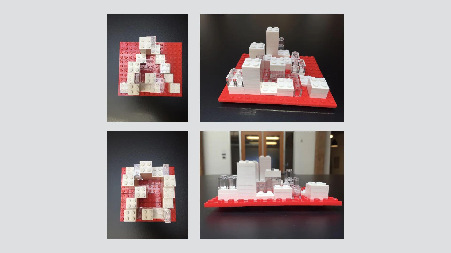
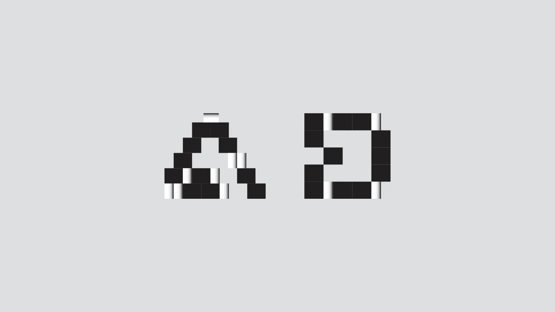
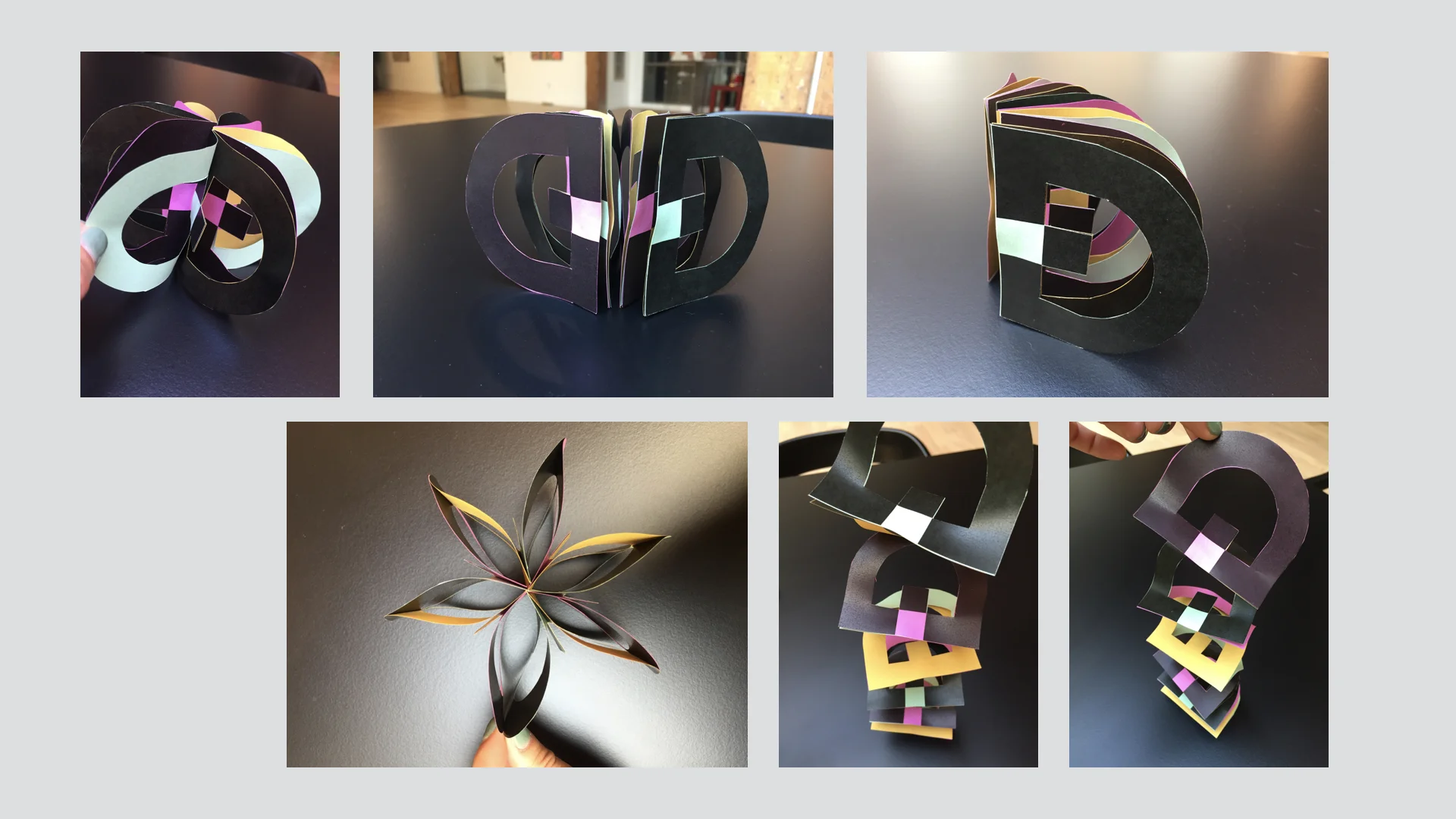
I also moved away from the screen and spent a few days using more tactile methods to inspire new typographic forms and creative concepts. I chose to use Lego as my building material because it symbolize Adobe's design products being the very building blocks for creatives to make beautiful ideas become possible. The different heights within the 3D typography is set out to represent talents of different skill levels all standing on fair grounds, hence, given the equal opportunities to create using Adobe products.
An example of one display typographic form concept based on the lego methodology.
Design is play
This is an ad-hoc additional product concept development—a mock-up of a Slinky in "D" logo shape.
The idea is to create a plastic pen holder that can be transformed into the original fidget toy "Slinky"
to inspire movements and play at our desk.
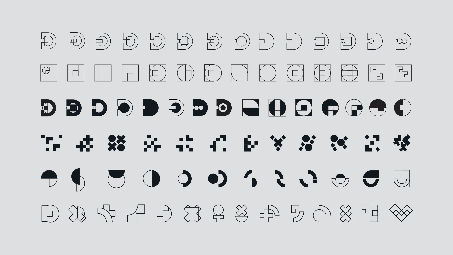
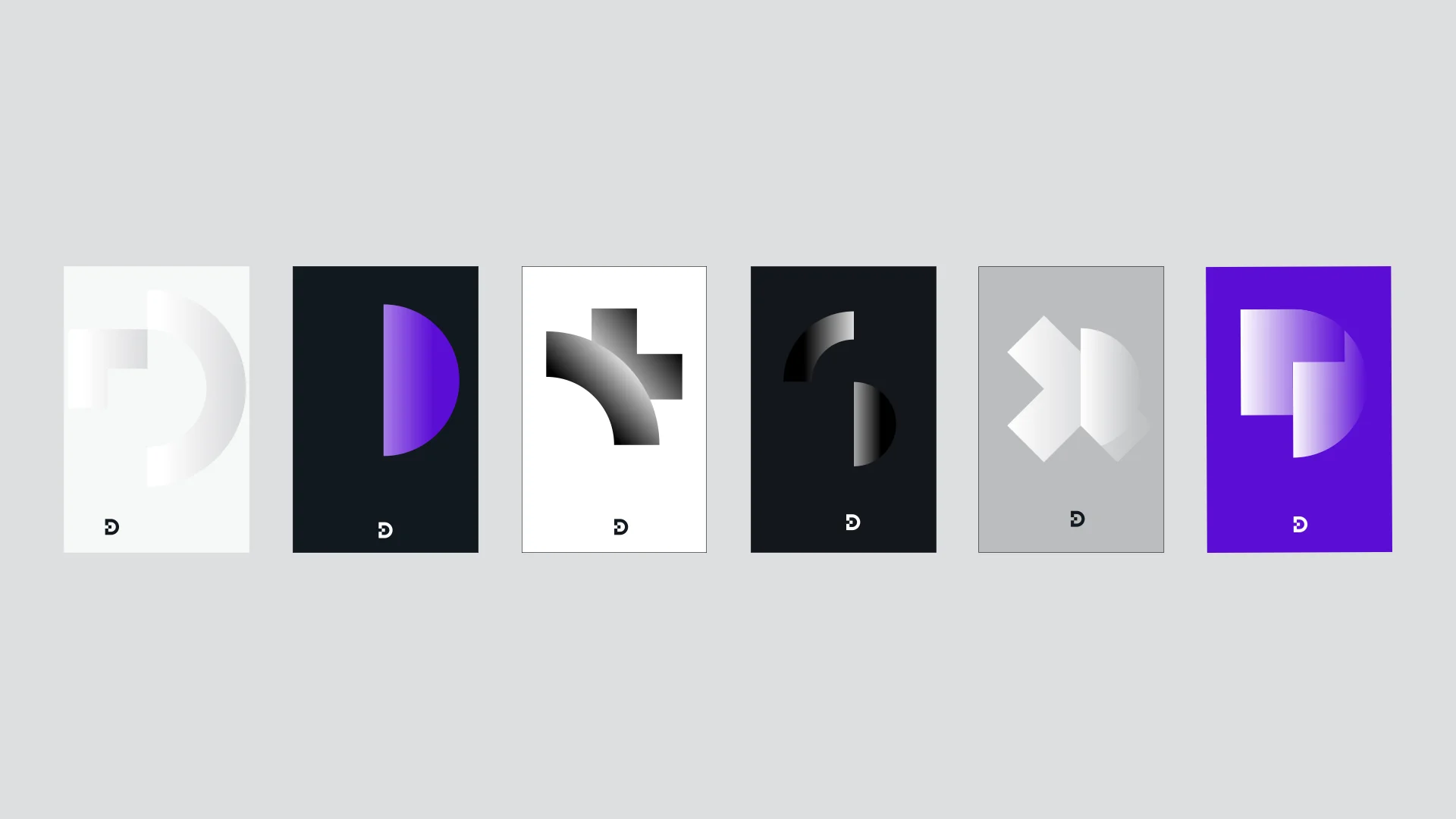
Playing with gradient color, pixel pattern and the core make up of brand elements.
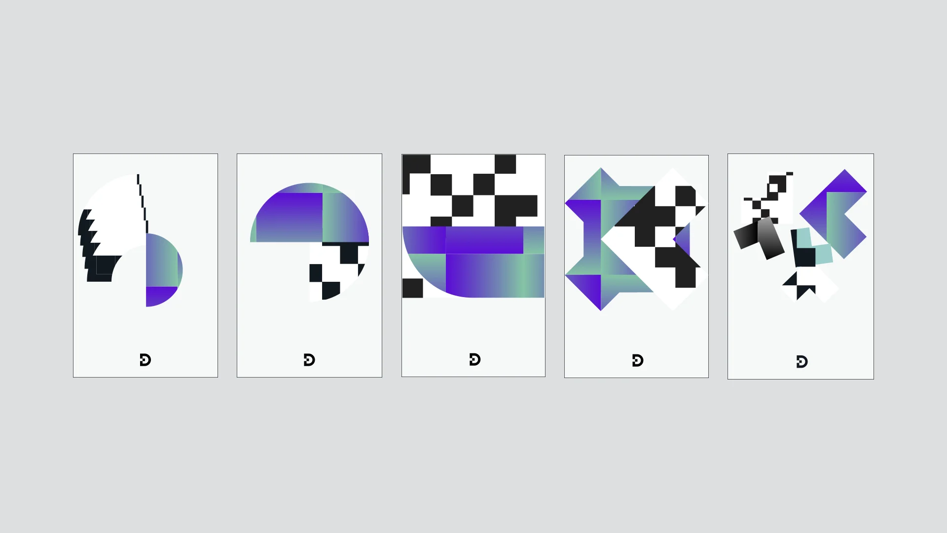
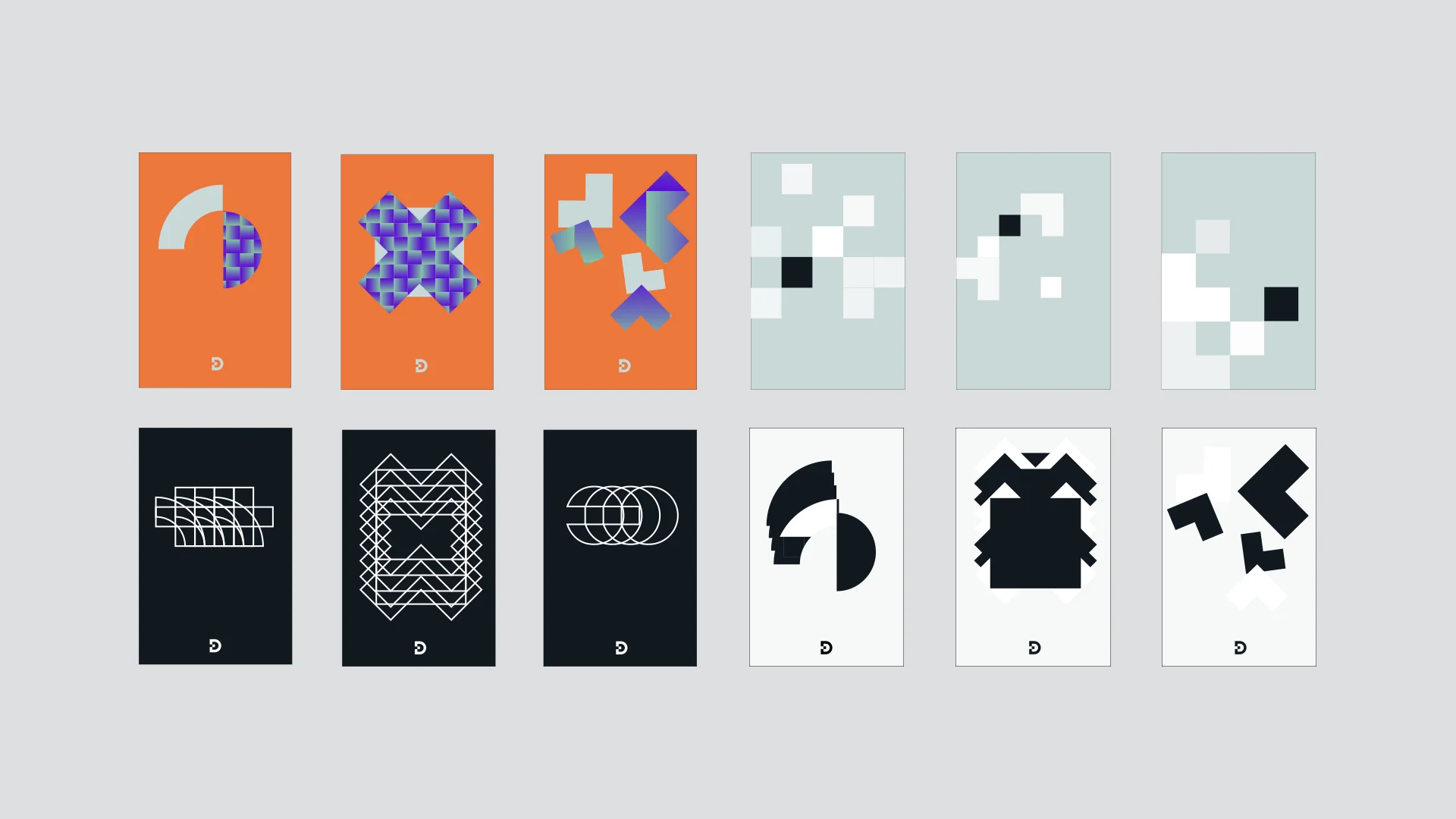
Poster design Ideations
Visual language concept Ideation
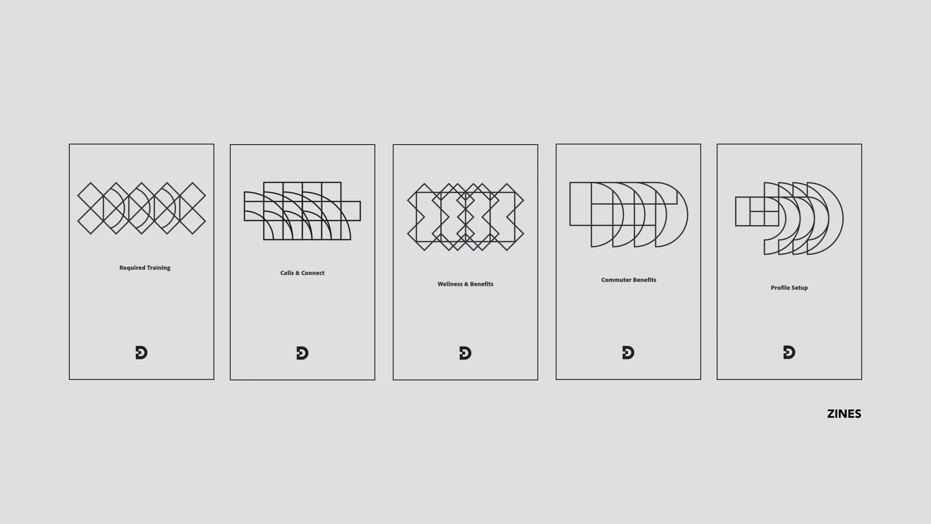
I eventually chose the repetitive elements as the core identity for the series of Zine hand outs.
Each zine consists of concise important informations that has been carefully selected,
simplified and designed for the information to be made more easily accessible and easy to understand.
FINAL OUTCOMES
—NEW HIRE 1st DAY HANDOUTS—
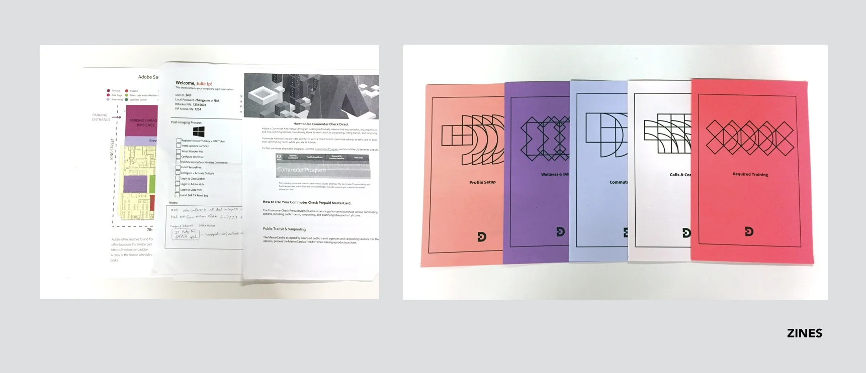
(left) Handouts with partial important information | (right) Set of zines with concise important information
Important information made more actionable by clean, easy to understand layout inside "required training" Zine
Simplified information inside "commuter benefits" zine
Information broken down into digestible portions inside "wellness and benefits" zine
Content distilled and explained inside "calls & connects" zine
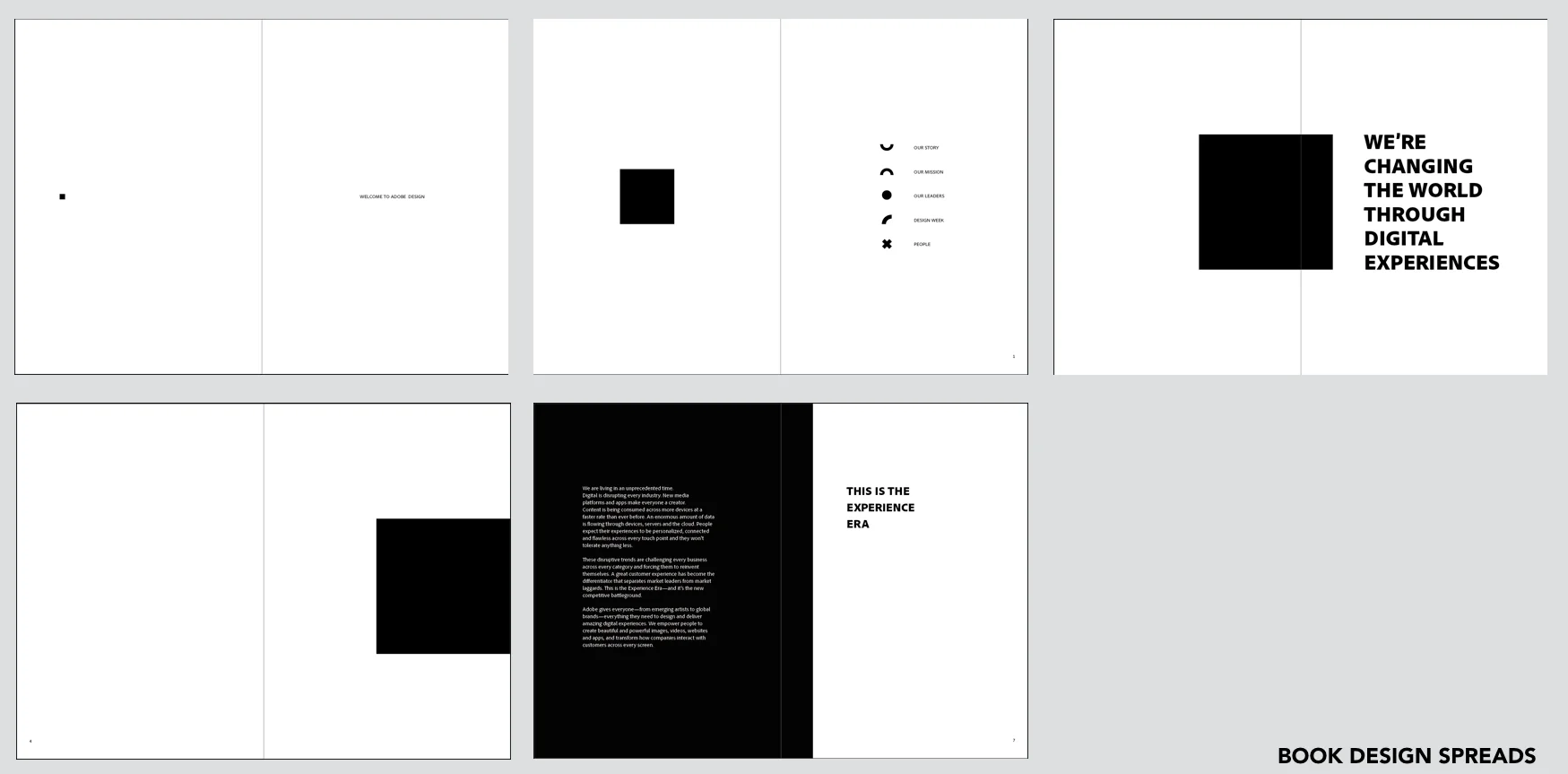
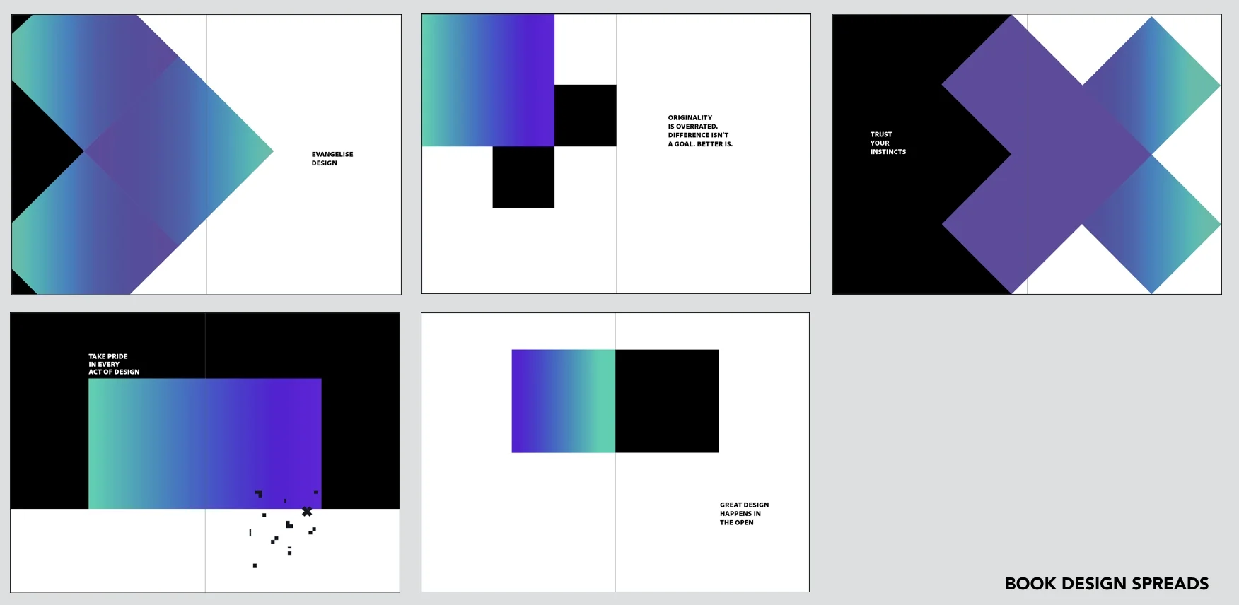
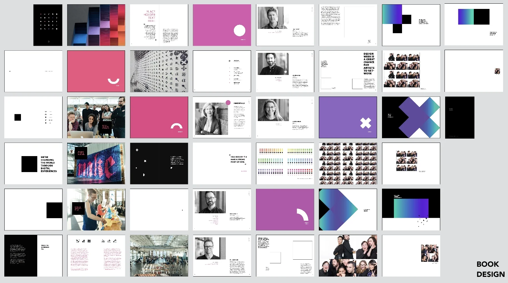
Adobe Culture Book Design Layout
Consistent "quotes" insert pages templates
Full draft of the book spread template design
—FIN—


